

Ryanair is the largest budget airline group in Europe, is always the first choice when people travel on a budget, and has more monthly active users than any of its competitors. However, they currently only provide a warning banner under the search section to remind passengers about COVID restrictions.

Most competitors provided an extension page for checking COVID status and regulations by various filter options.
However, from my user interview, I found that most users eventually still go on the government website to double-check the information.

User interview

Empathy Map
The empathy map helps me capture who a user is and to understand and prioritise user needs.


Key findings:
📄 What documents should be prepared?
“I didn't know we needed a passenger locator form until a week before the trip when I checked the government website.” - Shane
⌛ Keep eyes on the latest updates of destination countries.
"I have five countries' official website tabs on my browser and I refresh to check them from time to time.” - Molly
🏢 The official website source is critical.
“How can I know if this website is an official country website, they all look professional and legit.” - Jasmine


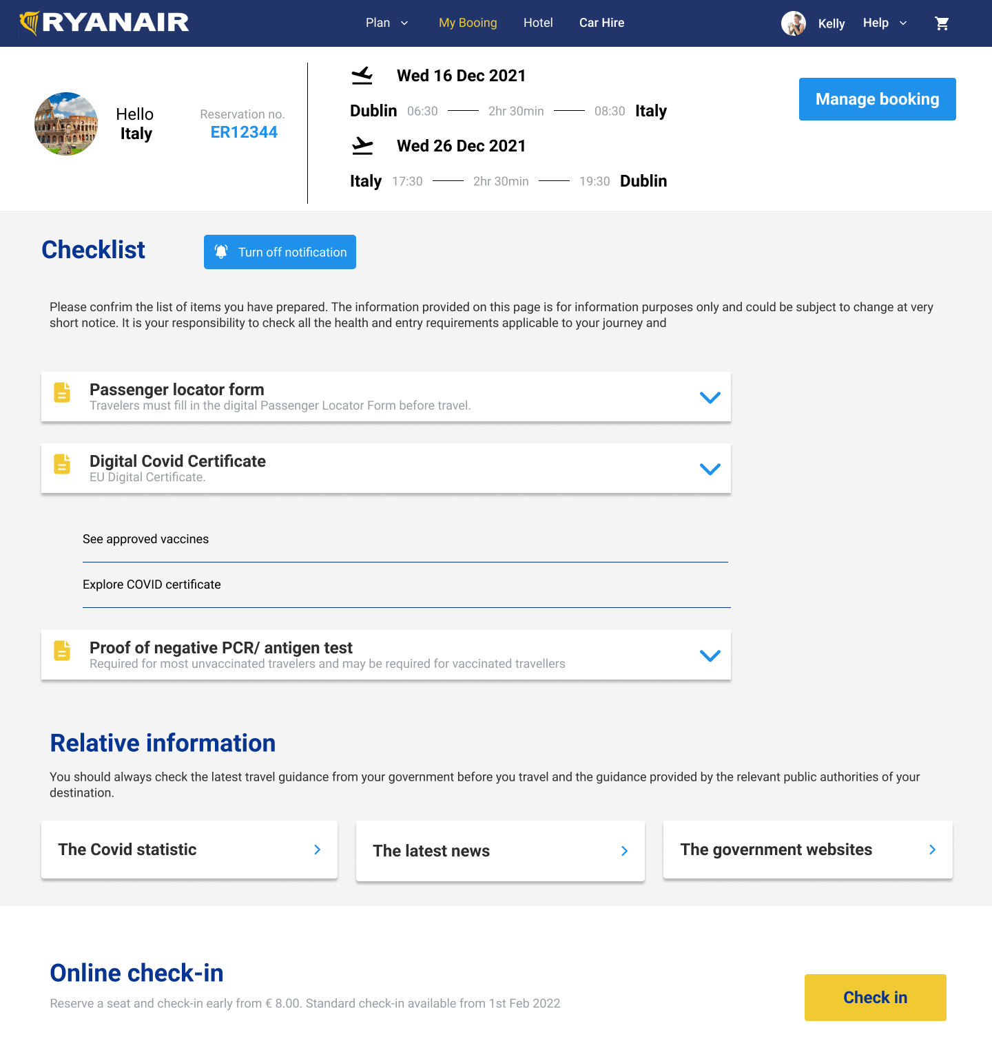
To discover pain points with the current design, I conducted usability testing with five participants on my first round of usability tests. Most participants found the checklist reminding them to prepare the required documents helpful. But there are some problems I uncovered during the tests:
To address sources of confusion and frustration from usability testing. Those iterations are outlined in the wireframe annotations below.


